
Anyone mold in their front plate cover?
 03-10-2010, 02:03 PM
#1
Burning Brakes

Thread Starter
Member Since: Aug 2007
Location: Chesterfield Michigan
Posts: 992
Likes: 0
Received 3 Likes
on
2 Posts
St. Jude Donor '08-'09-'10-'11-'12-'13-'14
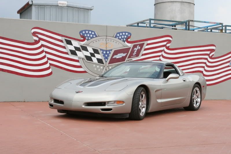
So I've decided I really like the stock look of the front of the C5, minus the nasty plate cover they stuck on there. Over the summer I plan on molding the plate cover right in and getting it painted over, but leaving the letters with black inserts.
Just wondering if anyone else has done this? Are there bolts holding the front bumper in place behind it or anything? I'm not sure why I don't see it more often, maybe a lot of people live in states where it's required.
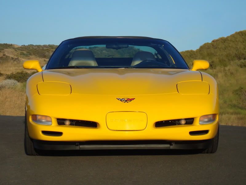
I'm not at home, so I found this pic online. I have a Z06 with screens and black letter inserts. I also removed the front emblem when I had the bumper repainted.
If anyone wants to photoshop the license plate cover molded smooth with the front, take off the C5 emblem, and fill in the CORVETTE letters black, we could see how it will really look.
Just wondering if anyone else has done this? Are there bolts holding the front bumper in place behind it or anything? I'm not sure why I don't see it more often, maybe a lot of people live in states where it's required.
I'm not at home, so I found this pic online. I have a Z06 with screens and black letter inserts. I also removed the front emblem when I had the bumper repainted.
If anyone wants to photoshop the license plate cover molded smooth with the front, take off the C5 emblem, and fill in the CORVETTE letters black, we could see how it will really look.
Last edited by jraschke11; 03-10-2010 at 05:00 PM.


 03-10-2010, 05:03 PM
#7
Burning Brakes
Thread Starter
Member Since: Aug 2007
Location: Chesterfield Michigan
Posts: 992
Likes: 0
Received 3 Likes
on
2 Posts
St. Jude Donor '08-'09-'10-'11-'12-'13-'14
Sooo...I found the write up by MarkyMarkGTM after a more thorough search. It was on page 5 and I only went through like 3-4 on my first search. 
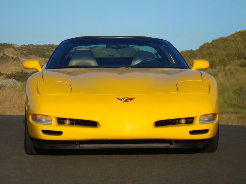
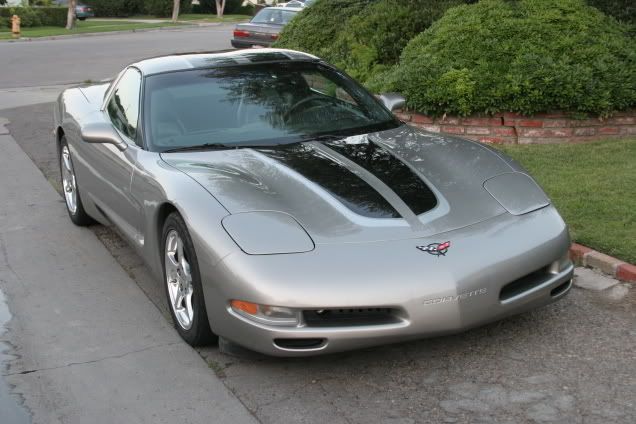
And after looking at the photoshop, I really don't know if it's the right thing to do with the way the yellow looks.
I already removed the emblem, and I like the way it looks there. But it just looks odd, with or without the Corvette lettering. It seems you can really tell something is missing, and not in the way I like.
I really don't like the Tigershark front end at all, but want to do something different with mine.
03-10-2010, 05:14 PM
#8
Drifting


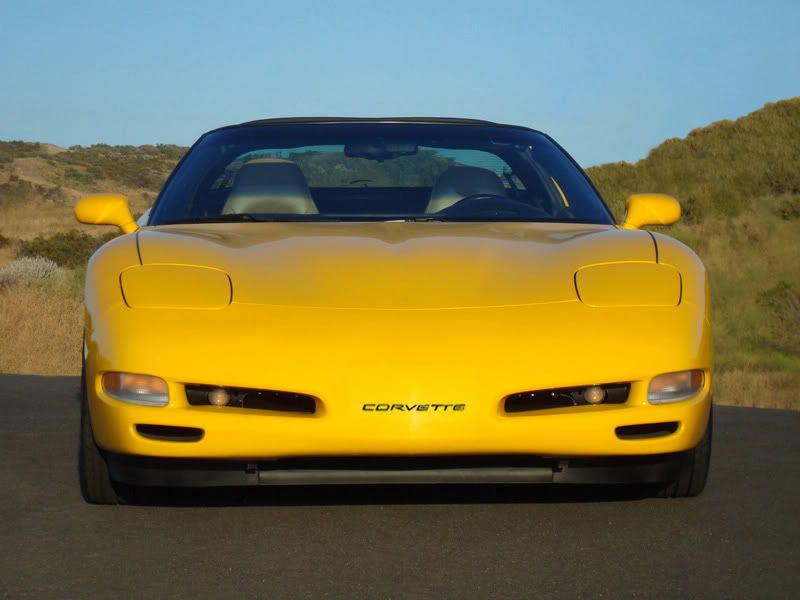
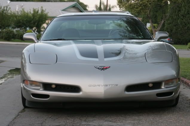
I agree, it almost seems to bare. undecided at this point. Maybe from different angles it would look more appealing. Can I get a photoshop of completely bare. Maybe the addition of fog light screens and some brake duct screens, would add a little more visual appeal to not having a plate or emblem.
03-10-2010, 05:19 PM
#9
Drifting
What throws it off for me is that the lettering is centered vertically on the license plate cover, but when blended the lettering is higher than the foglight openings and seems placed to high. If going to the trouble to do the blending, how about lowering the lettering to be centerd with the foglight openings. I know that's a whole lot more work, but sense it's just photshop, maybe try photoshoping the letters lower, and see if that feels better. I have zero photoshop skills, so sorry I can't help much, but be a pain the ****.

 03-10-2010, 05:31 PM
#12
Instructor


Member Since: Feb 2009
Location: Tuscaloosa AL
Posts: 234
Likes: 0
Received 0 Likes
on
0 Posts
What throws it off for me is that the lettering is centered vertically on the license plate cover, but when blended the lettering is higher than the foglight openings and seems placed to high. If going to the trouble to do the blending, how about lowering the lettering to be centerd with the foglight openings. I know that's a whole lot more work, but sense it's just photshop, maybe try photoshoping the letters lower, and see if that feels better. I have zero photoshop skills, so sorry I can't help much, but be a pain the ****.
Great idea, give me a few minutes.

 03-10-2010, 07:03 PM
#18
Drifting


 03-10-2010, 08:44 PM
#20
Instructor
Member Since: Feb 2009
Location: Tuscaloosa AL
Posts: 234
Likes: 0
Received 0 Likes
on
0 Posts
