Help me with new graphics on the race car
 04-01-2013, 09:29 PM
#1
Le Mans Master

Thread Starter

You can comment here on FaceBook with the others if you choose.
https://www.facebook.com/oli.thordar...type=1&theater

https://www.facebook.com/oli.thordar...type=1&theater
 04-01-2013, 09:54 PM
#2
Le Mans Master


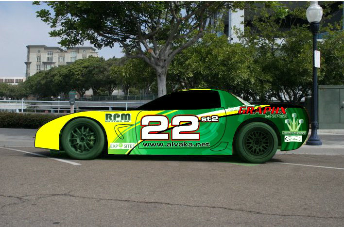
I like it. You can read everything. I am always amazed by graphics that you can only read up close when the car is stopped.
Jim
Jim
 04-05-2013, 06:04 PM
#6
Team Owner


Member Since: Dec 2010
Location: Hillsborough NC
Posts: 21,061
Received 745 Likes
on
429 Posts
NC Events Coordinator

The colors are fine. I'm not digging how the upsweep of the blue area is broken up by the side window. The window chops up the flow of the graphic.
I'd give it more of a "Coca-Cola wave" effect so that it intersects at the extreme upper back end of the door and then terminates at the corner of the bottom of the back window. That would make the entire roof yellow and the entire trunk area blue, and would prevent the "wave" from having a chunk missing.
My 2�. Good luck with that car.
 04-05-2013, 07:36 PM
#8
Le Mans Master
Thread Starter
I have several other renderings posted here on Facebook with 58 comments below.
https://www.facebook.com/oli.thordar...type=1&theater
Right now I am persuing the yellow to something. I have raced yellow so long nearly everyone is telling me it would not be the same to change colors.
With that said I am leaning towards the secondary colors of blue or green.


Oli
Last edited by Olitho; 04-05-2013 at 07:38 PM.
04-05-2013, 07:41 PM
#9
Le Mans Master

 04-07-2013, 06:42 AM
#14
Pro

I like the dark blue, and what jcsperson said about swooping the line so the window does not break it up. Need something forward of the front wheels. My OCD tells me so.
Looks nice.
Looks nice.
04-07-2013, 08:23 PM
#16
Burning Brakes

Member Since: Sep 2011
Location: Dallas/Fort Worth TX
Posts: 942
Received 0 Likes
on
0 Posts
They all look good. My choice in order of preference is:
1 - Green
2 - Light blue
3 - Dark blue
Can't lose. Looks awesome no matter which way you go.
1 - Green
2 - Light blue
3 - Dark blue
Can't lose. Looks awesome no matter which way you go.
04-08-2013, 02:35 PM
#17
Le Mans Master
Thread Starter
Thank you all for your feedback.
I am working with the graphics guy to hone down the final look of the car.
I will post when ready.
Oli
I am working with the graphics guy to hone down the final look of the car.
I will post when ready.
Oli
04-08-2013, 03:34 PM
#18
Drifting

I like the dark blue combo best, but some of the graphics don't stand out as well as they do on the others. I would probably make the "alvaka.net" a lighter color, maybe white with a different color outline so it stands out or go yellow and give it that cut out look. Maybe make the white boarder around the red "graphix" a little thicker to make it stand out more easily.
04-08-2013, 03:48 PM
#19
Le Mans Master
The light blue looks the best with the black wheels. You get too dark and you lose the car/wheel contrast. OR, you just need to do the yellow on top and go black/dark on the bottom. Dark blue and black wheels have never worked for me (art director/graphic artist professionally). For the green, I'd go ever so slightly lighter making sure the green had a good yellow base. It's hard to tell, but it looks like you are doing a black rear like the C5R? If so I'd make it go up the truck lid to meet the yellow then do an o-so-thin black stripe below the yellow stripe down the side of the car.