
Should I put the Corvette Script Emblem on the back?
 06-04-2017, 06:27 PM
#21
Melting Slicks

Thread Starter

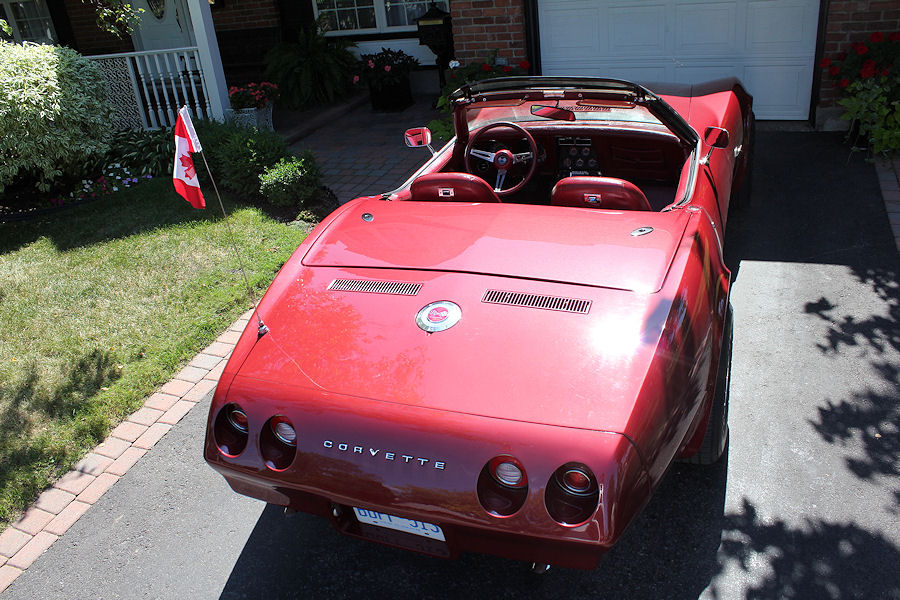
Personally, I think the "CORVETTE" lettering on the rear panel looks much better than the 'side' script "Stingray" emblem. You could select one from another model year, if you choose to do that.
But, it is YOUR car and you should do what looks best to you. If you really care about what other owners think about it, I would suggest that you NOT put the Stingray script on the rear panel.
But, it is YOUR car and you should do what looks best to you. If you really care about what other owners think about it, I would suggest that you NOT put the Stingray script on the rear panel.
I don't think the Stingray script would look good on the rear either. I never considered that as an option.
Mike

 06-04-2017, 07:37 PM
#24
Drifting


[QUOTE=Mod75;1594871478]I went with the 80 script also

Gotta have the script!
Mod I will trade you some rally wheels, trim and caps for those Vector wheels when you get done with them.
Gotta have the script!
Mod I will trade you some rally wheels, trim and caps for those Vector wheels when you get done with them.
06-04-2017, 09:59 PM
#25
Le Mans Master


Member Since: Jan 2007
Location: Danville Illinois
Posts: 9,289
Received 570 Likes
on
286 Posts
Finalist 2021 C3 of the Year - Modified
C3 of Year Finalist (appearance mods) 2019

Mod I will trade you some rally wheels, trim and caps for those Vector wheels when you get done with them.
midigike, i have had these Vectors for 40 years now so it will probably be a while.
midigike, i have had these Vectors for 40 years now so it will probably be a while.
06-04-2017, 10:30 PM
#26
Drifting
06-05-2017, 01:43 PM
#27
Team Owner

My interpretation of "script" was that of 'written letters'. The 'Stingray' emblem on the sides of early C3 Corvettes is identified as 'script emblems'. Hence, my misunderstanding of your question.
I still believe that the "CORVETTE" letters on the rear panel is better looking than a plain painted panel.
I still believe that the "CORVETTE" letters on the rear panel is better looking than a plain painted panel.


The following users liked this post:
jr73 (06-05-2017)


The following users liked this post:
The Punisher (06-13-2017)
06-13-2017, 11:40 PM
#32
Le Mans Master
I like the 80 text myself, and the red tail lights. The font looks just like Courier, the standard text font that I've been looking at for most of my life, so it's familiar. Compare this to the back of my car:
O O corvette O O
If my wife had to replace the text on her 79, I'd probably suggest the C7 version, as it looks like the Star Trek: TNG font. Her stock text is crooked, so I may get the chance.
O O corvette O O
If my wife had to replace the text on her 79, I'd probably suggest the C7 version, as it looks like the Star Trek: TNG font. Her stock text is crooked, so I may get the chance.

 06-17-2017, 02:53 AM
#34
Pro


 06-17-2017, 06:48 AM
#35
Team Owner
As a matter of fact, not by design, just chance, I have NO 'Corvette' names on my car, anywhere....have two sharks in the side scoops though.....the tabs on the Fuel Injection sign in back were removed, and the metal held in place with RTV.......
see pix below....
see pix below....