


LS1 hood emblems
Team Owner


Joined: Jun 2001
Posts: 23,376
Likes: 1,067
From: Virginia USA
Looks good but I think I would try fatting out the curved parts of the S to try and make it look more like the L and the 1....just my opinion. Think you could make up a ZZ4 for us crate motor dudes? Are you putting it on and LT-1 hood? When I get my LT-1 hood I want to put ZZ4 on it where the LT-1 should be.
Good job
John
Good job
John
Burning Brakes


Joined: Jan 2001
Posts: 1,004
Likes: 16
From: Gainesville, Florida
I love the ingenuity but I agree w/theandies...I would like it better if the vertical part of the "S" matched the L & 1. I took the liberty with a pen....

Mark
[Modified by mdsmith, 10:22 PM 11/8/2001]
Mark
[Modified by mdsmith, 10:22 PM 11/8/2001]
Corvette Stories
The Best of Corvette for Corvette Enthusiasts

Top 10 Most Expensive Corvettes Ever Sold on Bring A Trailer
Brett Foote
10 Things Every Corvette Owner Needs (2026 Edition)
Michael S. Palmer
8 Most "Only Corvette Owners Understand" Quirks and Problems
Pouria Savadkouei
10 Reasons the C6 Z06 is Still A Performance Benchmark After 20 Years
Joe Kucinski
How Much Horsepower Every Corvette Engine "LOST" in 1972
Joe Kucinski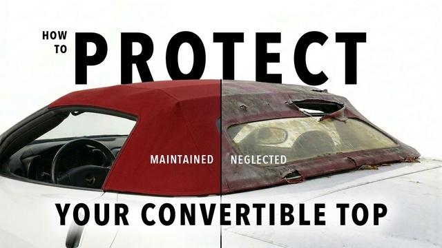
Top 10 DOs and DON'Ts for Protecting Your Convertible Top!
Michael S. Palmer
Top 10 Most Explosive Corvettes Ever Made: Power-to-Weight Ratio Ranked!
Joe Kucinski
150 hp to 1,250 hp: Every Corvette Generation Compared by the Specs That Matter
Joe Kucinski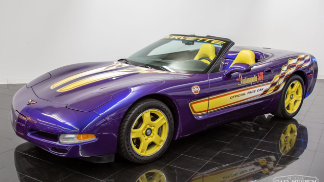
8 Coolest Corvette Pace Cars (and Replicas) of All Time
Verdad GallardoTeam Owner


Joined: Jul 1999
Posts: 65,492
Likes: 230
From: Orange Park Florida
IMO, too fancy wit the fonts, too hard to read, narrow up the fat parts....
in a car at speed, or even from streetside viewing...it's not readable...just a blur....especially to people with glasses....
GENE
in a car at speed, or even from streetside viewing...it's not readable...just a blur....especially to people with glasses....
GENE
Thread Starter
Melting Slicks


Joined: May 2001
Posts: 2,812
Likes: 4
From: Gig Harbor Wa
Thanks for all your help. I sent the new design to my buddy to make.He is getting the vinyl this weekend so it shouldn't be too much longer. i will take some pictures of them on the car and post them.
Safety Car

Joined: Nov 2001
Posts: 3,728
Likes: 1
From: Maple
looks great...in the picture on your sig the L looks as if it could be a bit narrower..it looks wider than the S....maybe try to keep the fat part of the LS-1 the same width...
[Modified by 1bad69, 12:28 PM 11/11/2001]
[Modified by 1bad69, 12:28 PM 11/11/2001]