


 . Are you going to start to sell parts? Or did I mis that?

New EG Website - Constructive Comments?
Thread Starter
Supporting Tuner
Joined: Sep 2004
Posts: 51,896
Likes: 39
From: ================== Houston, Texas www.englandgreen.com ================== Necessary Evil� __________
CI 6-7-8-9-10 Veteran
St. Jude Donor '05-'06-'07-'08-'09-'10-'11-'12-'13-'14
So after a year of my old website that looked like something a 4 year old created, I finally got around to revamping my website.
It is still in it's embryonic stage, with some 6000 pictures to add, as well as a few dozen videos, FAQ, Contact page, disclaimer, copyright, biography, price lists and online ordering.
But it's a start.
www.englandgreen.com
Constructive comments?
Stephen
It is still in it's embryonic stage, with some 6000 pictures to add, as well as a few dozen videos, FAQ, Contact page, disclaimer, copyright, biography, price lists and online ordering.
But it's a start.
www.englandgreen.com
Constructive comments?
Stephen
Thread Starter
Supporting Tuner
Joined: Sep 2004
Posts: 51,896
Likes: 39
From: ================== Houston, Texas www.englandgreen.com ================== Necessary Evil� __________
CI 6-7-8-9-10 Veteran
St. Jude Donor '05-'06-'07-'08-'09-'10-'11-'12-'13-'14

Team Owner

Joined: Jul 2003
Posts: 20,474
Likes: 2
From: Detroit
1). The site is clean, but it lacks the "buy something now" feel. Maybe add some color.
2). Add a section of completed projects, possibly including track and dyno videos/sheets.
3). On the map section print the address at the bottom of the screen (I know it's on the main site, but it should be on both .. This info is helpful for GPS assisted crews. )
)
4). Need a product list (even just a partial list) with some prices.
5). Way more pics all the way around. We live in a visually driven society. You want something that will communicate excitement and urgency.
Good luck.
2). Add a section of completed projects, possibly including track and dyno videos/sheets.
3). On the map section print the address at the bottom of the screen (I know it's on the main site, but it should be on both .. This info is helpful for GPS assisted crews.
)4). Need a product list (even just a partial list) with some prices.
5). Way more pics all the way around. We live in a visually driven society. You want something that will communicate excitement and urgency.
Good luck.
Thread Starter
Supporting Tuner
Joined: Sep 2004
Posts: 51,896
Likes: 39
From: ================== Houston, Texas www.englandgreen.com ================== Necessary Evil� __________
CI 6-7-8-9-10 Veteran
St. Jude Donor '05-'06-'07-'08-'09-'10-'11-'12-'13-'14
^ I was trying to keep the entrance as small and possible so it would load fast.
The subpages will be intensely media heavy, with almost 40 videos in hi-res/192k sound and an insane amount of pictures (the complete Grond Chronicles, for example in 1024x768) - over 6000 pictures.
The subpages will be intensely media heavy, with almost 40 videos in hi-res/192k sound and an insane amount of pictures (the complete Grond Chronicles, for example in 1024x768) - over 6000 pictures.
Corvette Stories
The Best of Corvette for Corvette Enthusiasts

Top 10 Most Expensive Corvettes Ever Sold on Bring A Trailer
Brett Foote
10 Things Every Corvette Owner Needs (2026 Edition)
Michael S. Palmer
8 Most "Only Corvette Owners Understand" Quirks and Problems
Pouria Savadkouei
10 Reasons the C6 Z06 is Still A Performance Benchmark After 20 Years
Joe Kucinski
How Much Horsepower Every Corvette Engine "LOST" in 1972
Joe Kucinski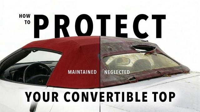
Top 10 DOs and DON'Ts for Protecting Your Convertible Top!
Michael S. Palmer
Top 10 Most Explosive Corvettes Ever Made: Power-to-Weight Ratio Ranked!
Joe Kucinski
150 hp to 1,250 hp: Every Corvette Generation Compared by the Specs That Matter
Joe Kucinski
8 Coolest Corvette Pace Cars (and Replicas) of All Time
Verdad Gallardo
Melting Slicks


Joined: Feb 2001
Posts: 3,376
Likes: 4
From: Hershey, PA, USA
Cruise-In VI Veteran
St. Jude Donor '12
make the font alittle bigger... and around the information box add some more visuals, kinda looks boring with just a white box in the center something simple around the edge would help
other than that LOOKS GREAT
other than that LOOKS GREAT


Melting Slicks


Joined: Feb 2006
Posts: 3,159
Likes: 247
From: LAS VEGAS NV
St. Jude Donor '08
IMO
1.You need some covette on the front page for sure. look at westcoastcorvette.... very eye catching
2.You need on the side of the page some kind of category tabs
i.e. engine
forced inductions
drivetrain..
3.c5/c6 categories
when someone scrolls over drivetrain.. it its will display clutch, gears etc..
Bandwith these days are a thing of the past.. people are surfing at 3-12 meg a sec..no one is using 56k.. so loading videos and front page is nothing..
i know you only started ,,but just somethings that i like on a website,
Melting Slicks

Joined: Aug 2007
Posts: 2,721
Likes: 4
From: Elizabethtown
More flash.
Def needs Some more pics of Corvettes on the home page.
Maybe add a news feed to the home page so people can see what insane projects you got going on.
The white box is kind of boring, not really eye catching.
The font could be better.
Needs more color.
The top links are bland.
Testimony section. If the client section is the testimony section then disregard that.
Don't get me wrong. It's not bad at all. I've seen some ****ty websites in my time, but things can always get improved
Thread Starter
Supporting Tuner
Joined: Sep 2004
Posts: 51,896
Likes: 39
From: ================== Houston, Texas www.englandgreen.com ================== Necessary Evil� __________
CI 6-7-8-9-10 Veteran
St. Jude Donor '05-'06-'07-'08-'09-'10-'11-'12-'13-'14
Thank you for all the useful (and quite entertaining) suggestions.
As I am creating this Strawman website in my spare time, of which I have very little, it will take a little while for it to flesh out. However, I do sincerely thank you all for taking the time to critique the site and offer constructive criticism.
Thanks
Stephen
As I am creating this Strawman website in my spare time, of which I have very little, it will take a little while for it to flesh out. However, I do sincerely thank you all for taking the time to critique the site and offer constructive criticism.
Thanks
Stephen
Team Owner
Joined: Oct 2001
Posts: 46,766
Likes: 5
From: Boynton Beach Florida
St. Jude Donor '07-'12, '20
Yo Stephen..... 
1) Spell everything in ENGLISH None of this other side of the pond crap. This here is the good ole USA learn it, love it, live it.
2) For us old guy's that double zero font SUCKS Needs to be bigger so we can actually tell it is not catching our eye. 
3) That opening page does nothing for me. I see that first page and think, why continue? Since there is nothing exciting on the page EVERYONE WILL SEE I might as well move onto a competitor that wants me to go deeper into their site.
Sorry, just can't see the Brit wanting me to sugar coat my answer.
Bob
1) Spell everything in ENGLISH
None of this other side of the pond crap. This here is the good ole USA learn it, love it, live it. 2) For us old guy's that double zero font SUCKS
Needs to be bigger so we can actually tell it is not catching our eye. 3) That opening page does nothing for me. I see that first page and think, why continue? Since there is nothing exciting on the page EVERYONE WILL SEE I might as well move onto a competitor that wants me to go deeper into their site.
Sorry, just can't see the Brit wanting me to sugar coat my answer.
Bob
Le Mans Master


Joined: Jan 2003
Posts: 6,059
Likes: 12
From: AKA Harvey Mushman-I know just enough to be dangerous "Those who sacrifice liberty for safety deserve neither"- B. Franklin
Senior Member
Cruise-In V Veteran


Melting Slicks


Joined: Dec 2002
Posts: 2,480
Likes: 62
From: Middletown DE
Wonder if some background pics of grond would help.... Like the custom shifter work, fuel system, custom body work, etc..
Not that you are promoting the custom work you have done, but to show that you know a bit more then how to just bolt on kits designed for DIY'ers. Anyone can bolt parts on, but it is hard to find people that treat the car like it is their own.
Good Luck Stephen!
oh yeah, ditch the UK english Are you a US citizen yet?
Not that you are promoting the custom work you have done, but to show that you know a bit more then how to just bolt on kits designed for DIY'ers. Anyone can bolt parts on, but it is hard to find people that treat the car like it is their own.
Good Luck Stephen!
oh yeah, ditch the UK english
Are you a US citizen yet?
Thread Starter
Supporting Tuner
Joined: Sep 2004
Posts: 51,896
Likes: 39
From: ================== Houston, Texas www.englandgreen.com ================== Necessary Evil� __________
CI 6-7-8-9-10 Veteran
St. Jude Donor '05-'06-'07-'08-'09-'10-'11-'12-'13-'14


Instructor


Joined: Sep 2006
Posts: 214
Likes: 1
From: OR
Anyway, Stephen a great start!
And lots of good comments already. I tend to agree that while the site is very clean (which is my preference). It boarders on the sterile, a little bit too understated.
Also noticed a question mark in your statement below authorized dealers statement (so you changed it to American eh?)... Good luck!
" We are Corvette owners and treat our customers cars like our own."

5th Gear
Joined: Aug 2007
Posts: 5
Likes: 0
The site looks like it is off to a good start. I noticed the gray background makes the gray font difficult to read. Some other suggestions; make the descriptions of your product/service line up link to the page with the product info/price. Put your best work and products up front along with a link to 'specials'. Good luck.
