


Website choice round two...
Thread Starter
Platinum Supporting Dealership


Joined: Dec 2003
Posts: 3,017
Likes: 3
From: Dearborn, MI
St. Jude Donor '06
My designer is doing a GREAT job on my site. They are giving me 3 rounds of mock ups to choose from before the real thing is picked. Please let me know what you think between these. 
http://www.davindi-dev.com/rickdaniel/
http://www.davindi-dev.com/rickdaniel/
__________________
Goran Krstovski
Les Stanford Chevrolet
M - 800-699-8388
D - 313-724-1479
www.corvetteking.com
goran_krstovski@lesstanford.com
Goran Krstovski
Les Stanford Chevrolet
M - 800-699-8388
D - 313-724-1479
www.corvetteking.com
goran_krstovski@lesstanford.com
Moderator


Joined: Feb 2006
Posts: 39,134
Likes: 17,983
From: DFW Area TX
I think the existence of the round 1 pages is confusing everybody. For round two, I go with homepage 1.3 for color choice, homepage 1.8 for Nationwide Corvette Sales text placement and the corresponding subpage 1.3.
Homepage 1.3 because the color contrast is the best in the group. Homepage 1.8 for text placement because it flows the best with your logo and does not disrupt the other graphics.

Homepage 1.3 because the color contrast is the best in the group. Homepage 1.8 for text placement because it flows the best with your logo and does not disrupt the other graphics.
Corvette Stories
The Best of Corvette for Corvette Enthusiasts

Top 10 Most Expensive Corvettes Ever Sold on Bring A Trailer
Brett Foote
10 Things Every Corvette Owner Needs (2026 Edition)
Michael S. Palmer
8 Most "Only Corvette Owners Understand" Quirks and Problems
Pouria Savadkouei
10 Reasons the C6 Z06 is Still A Performance Benchmark After 20 Years
Joe Kucinski
How Much Horsepower Every Corvette Engine "LOST" in 1972
Joe Kucinski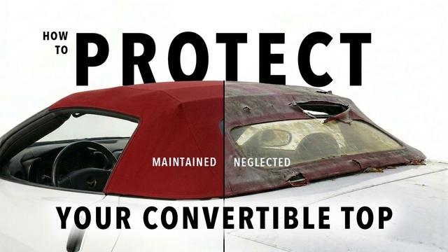
Top 10 DOs and DON'Ts for Protecting Your Convertible Top!
Michael S. Palmer
Top 10 Most Explosive Corvettes Ever Made: Power-to-Weight Ratio Ranked!
Joe Kucinski
150 hp to 1,250 hp: Every Corvette Generation Compared by the Specs That Matter
Joe Kucinski
8 Coolest Corvette Pace Cars (and Replicas) of All Time
Verdad Gallardo


Advanced


Joined: Dec 2005
Posts: 83
Likes: 0
Im a big fan of Blue cars #1 page. Strangely enough an Orange car would be my last personal driver choice. But I must say the Orange # 2 page is a real eye grabber even more so than the Yellow. My choice for your page is First # 2 then # 1. Good luck.
Last edited by stingray6769707606; Dec 14, 2006 at 06:24 AM. Reason: extra work and spell check


Instructor
Joined: Feb 2006
Posts: 218
Likes: 0
From: Northern California
I think the existence of the round 1 pages is confusing everybody. For round two, I go with homepage 1.3 for color choice, homepage 1.8 for Nationwide Corvette Sales text placement and the corresponding subpage 1.3.
Homepage 1.3 because the color contrast is the best in the group. Homepage 1.8 for text placement because it flows the best with your logo and does not disrupt the other graphics.
Homepage 1.3 because the color contrast is the best in the group. Homepage 1.8 for text placement because it flows the best with your logo and does not disrupt the other graphics.

The bald eagle makes the page look busy and is distracting.

Burning Brakes


Joined: Feb 2005
Posts: 1,001
Likes: 7
From: Altamonte Springs FL
St. Jude Donor '07-'08-'09-'10-'11
NCM Sinkhole Donor

