


new c6 logo

Thread Starter
6th Gear

Joined: Mar 2003
Posts: 6
Likes: 0
From: northridge ca
Hi, im taking a design class and I redesigned the corvette logo for the upcoming C6, assuming its redesign follows the trend of the new thunderbird and retro looking mustang gt concept. The logo should have the classic look but a bit modernized. Here are three of my finals choices. I would like your opinion on what you like best and why. Thanks, please be easy on me, im just a student 
Team Owner


Joined: Jan 2002
Posts: 23,234
Likes: 4
From: All that glitters is Gold - Hockey Is CANADA'S game
Cruise-In VI Veteran
Cruise-In VII Veteran
St. Jude Donor '05-'06
I'll be easy on you... :leaving:
Reminds me of the font you'd see on a movie cover from the '70s.
Reminds me of the font you'd see on a movie cover from the '70s.
Also reminds me of the letter on the Disco Albums
Thread Starter
6th Gear
Joined: Mar 2003
Posts: 6
Likes: 0
From: northridge ca
k thanks a lot for your feedback.
Also, please give me ideas on what you would like to see.. It helps a lot more than just saying it sucks :)
[Modified by shahin, 7:17 AM 3/12/2003]
Also, please give me ideas on what you would like to see.. It helps a lot more than just saying it sucks :)
[Modified by shahin, 7:17 AM 3/12/2003]
Race Director

Joined: Jun 2000
Posts: 14,537
Likes: 2
From: I don't have to show you any stinkin' badges
Reminds me of the font you'd see on a movie cover from the '70s.
Also reminds me of the letter on the Disco Albums
Also reminds me of the letter on the Disco Albums
[Modified by 4DCYKEY, 1:17 AM 3/12/2003]
Race Director
Joined: Jun 2000
Posts: 14,537
Likes: 2
From: I don't have to show you any stinkin' badges
Also, please give me ideas on what you would like to see.. It helps a lot more than just saying it sucks :)
Herb :cheers:
[Modified by 4DCYKEY, 1:24 AM 3/12/2003]
Corvette Stories
The Best of Corvette for Corvette Enthusiasts

Every 2027 Corvette Engine Explained
Joe Kucinski
Designer Imagines A Corvette That Looks More Like a Corvette Than the Corvette
Verdad Gallardo
10 Ugly Corvettes That We Still Kinda Love
Joe Kucinski
Top 10 Most Expensive Corvettes Ever Sold on Bring A Trailer
Brett Foote
10 Things Every Corvette Owner Needs (2026 Edition)
Michael S. Palmer
8 Most "Only Corvette Owners Understand" Quirks and Problems
Pouria Savadkouei
10 Reasons the C6 Z06 is Still A Performance Benchmark After 20 Years
Joe Kucinski
How Much Horsepower Every Corvette Engine "LOST" in 1972
Joe Kucinski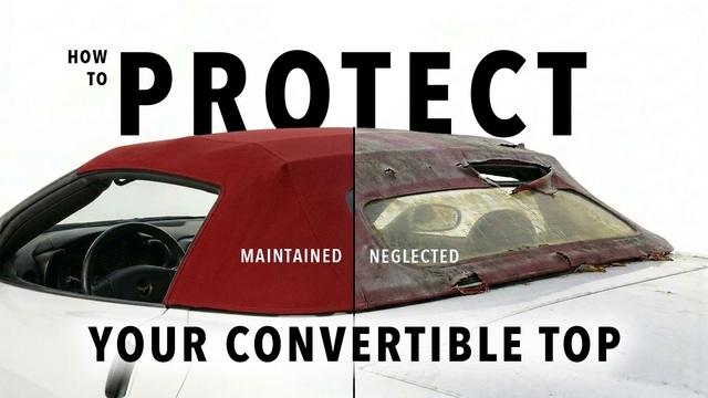
Top 10 DOs and DON'Ts for Protecting Your Convertible Top!
Michael S. PalmerTeam Owner
Joined: Jan 2002
Posts: 23,234
Likes: 4
From: All that glitters is Gold - Hockey Is CANADA'S game
Cruise-In VI Veteran
Cruise-In VII Veteran
St. Jude Donor '05-'06
Try to find a font that symbolizes those traits. I would think that leaning letters (italized),
Yes, I was dating myself with the Disco Album comment
Team Owner

Joined: Sep 2001
Posts: 28,675
Likes: 10
From: Ormond Beach FL
NCM Ambassador
CI-3-4, 9 & 10 Car Show Winner
CI-3-4-5-6-7-8-9-10 Veteran
St. Jude Donor '04-'05-'06-'07-'08-'09-'10,'14, '16
St Jude Fedex Bowl Donor '09
Yeah to retro looking for me...but nice try with your class work
I would like to see the slant like the C5 letters are...something on those lines...and some boldness added..
Just a thought...
I would like to see the slant like the C5 letters are...something on those lines...and some boldness added..
Just a thought...
Le Mans Master


Joined: Jun 2002
Posts: 9,595
Likes: 59
From: Along the St. Johns
St. Jude Donor '06 thru '16,'22,'24
I think the letters should be anchored at the bottom instead of hung from the top... more of a Vette tradition. Also prefer italics myself. Make a play off the C1 script.

Melting Slicks

Joined: Apr 1999
Posts: 2,914
Likes: 4
From: Westford MA
As other said, the letters should convey a sense of speed and power. But they should also be bold and should have a strong presence. Right now...they look apologetic. For starters, I'd switch to capital letters. It's not a corvette. It's a CORVETTE! Joining the letters together was an interesting approach, but the CO at the begining gets left out...just sitting there on it's own. Is it a CO. Vette? In summary, I would strive to include this feelings in the font. Speed, Power, Nimbleness, Boldness, Authority, Fun. Good luck.
Scott
Scott

Team Owner
Joined: Mar 2001
Posts: 24,592
Likes: 44
From: The Rock Arkansas
Elite Member
Cruise-In III Veteran
"Corvette" really needs to be in itallics for me to show a sense of forward movement.
[Modified by Doughan, 10:02 PM 3/13/2003]
[Modified by Doughan, 10:02 PM 3/13/2003]

Drifting


Joined: Sep 2000
Posts: 1,987
Likes: 78
From: SoCal.
Way too kick back, not enough POWER in the font. The e�s are cruzzing along happy, not in a hurry to win a race. Also watch the negative space between the letters it is inconsistent. As suggested, try caps; also try varying the stroke a bit more if you are staying with a semi-cursive style.
Please post you new ideas.
Please post you new ideas.
Successful Plumber


Joined: Feb 2001
Posts: 43,830
Likes: 14
From: Top of the hill, 3rd mailbox on the right. Texas
CF NCM Ambassador
CI 6-7-9-10 Veteran
St. Jude Donor '06-'07-'08-'09-'10
NCM Member '09
Your retro look seems to only go back to the mid 70's. With appologies to my C3 friends, those weren't the classic Corvettes from which I'd take styling cues for a logo.
My understanding is the C6 will be a more forward thinking, more dynamic look rather than a retro effort like the current Fords -
If I were doing it I'd head in a direction more like this -

[Modified by jholmes, 12:06 PM 3/14/2003]
My understanding is the C6 will be a more forward thinking, more dynamic look rather than a retro effort like the current Fords -
If I were doing it I'd head in a direction more like this -
[Modified by jholmes, 12:06 PM 3/14/2003]
Race Director
Joined: Jun 2000
Posts: 14,537
Likes: 2
From: I don't have to show you any stinkin' badges
Good example! I am sure that the Corvette lettering is aligned, but it must be the background that makes the lettering to me seem like it is sloping down, left to right. Optical illusion, I suppose. I particularly like the metal highlighted lettering. :cheers:

Intermediate
Joined: Sep 2002
Posts: 37
Likes: 0
From: Naperville Illinois
ya, seems a little retro. if you got photoimpact, you can make some pretty kick butt logos. try searching for a downloadable version off of yahoo or something, its worth it
Safety Car

Joined: Dec 2002
Posts: 4,869
Likes: 2
From: San Diego CA
If you go retro.....avoid the 70's! Some of the early Corvette lettering was more interesting than the current script. Perhaps try a more modern written look as opposed to printed.