
Photoshop of round tail lights?


 01-20-2013, 09:46 PM
#322
Burning Brakes

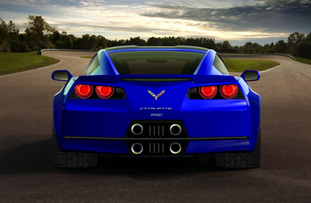
Aftermarket tails like above should satisfy those folks that can't live without round lights and they shouldn't be very expensive. (certainly cheaper than custom seats) A simple bolt on . Much less trouble/work than those ugly *** three lights so many added to the midyears. That's one of the big reasons I love Corvettes, we can modify them to suit our taste. No matter what others think.
01-21-2013, 12:48 AM
#323
Heel & Toe


Member Since: Apr 2006
Posts: 17
Likes: 0
Received 0 Likes
on
0 Posts

One design had 3 round lights with the outside lights having the backup lights...great, but why not have the outside also be an Amber ring for turn signals with the inside 2 lights on each side, red for stopping.
Many of the photos that GM released gave an amber glow to the bottom of the lights, leading a person to think they (like the interior seating) had come into the 21st Century....Just Sayin'
Many of the photos that GM released gave an amber glow to the bottom of the lights, leading a person to think they (like the interior seating) had come into the 21st Century....Just Sayin'
01-21-2013, 12:39 PM
#324
btw - am a 62 year old geezer with an 08 coupe and would gladly take a C7 with or without the 3OG option.

 01-22-2013, 08:22 PM
#326
Melting Slicks


Member Since: Jun 2007
Posts: 2,042
Likes: 0
Received 0 Likes
on
0 Posts
01-22-2013, 08:32 PM
#327
Race Director

 01-22-2013, 09:06 PM
#328
Burning Brakes
Wow, remember the C7 has the same transverse leaf springs set up so, stance can be changed in less time than it takes to wash the car. As far as the back end set up of the other photoshoped C7, I like the existing lights better than those (very asian looking) but the Lambo style exhaust is interesting.
01-22-2013, 09:14 PM
#329
Melting Slicks


 01-22-2013, 09:40 PM
#331
Race Director
01-22-2013, 10:28 PM
#332
It's not just the lights guys. The whole rear end just does not match the rest of the car.
It looks bulged out. And the then the transformer style pieces just really look out of place.
It needs to slant in like this so that it follows the lines of the rest of the car:

And then you can do whatever with the lights, but some rounded style will allow people to immediately recognize it as a Vette.
Sorry, I am not real great at Photoshop, but you get the idea.
It looks bulged out. And the then the transformer style pieces just really look out of place.
It needs to slant in like this so that it follows the lines of the rest of the car:
And then you can do whatever with the lights, but some rounded style will allow people to immediately recognize it as a Vette.
Sorry, I am not real great at Photoshop, but you get the idea.
Last edited by Danny Richie; 01-23-2013 at 05:13 PM.
 01-23-2013, 08:28 AM
#334
Le Mans Master


Guys,
You need to remember that aesthetics are not the only parameter that the design looks to optimize. One of the primary objectives that has been stated for this car is the management of airflow. That has an aesthetic of its own.
You need to remember that aesthetics are not the only parameter that the design looks to optimize. One of the primary objectives that has been stated for this car is the management of airflow. That has an aesthetic of its own.
01-23-2013, 04:57 PM
#335
4th Gear

Member Since: Jan 2013
Location: Colorado
Posts: 4
Likes: 0
Received 0 Likes
on
0 Posts
 haha, the top portion of it does. didn't even notice it. I redid the light designs. they look a little bright and blurry but the idea is there. Do you guys like those? I personally like the the first ones(nsx) a little better as they seem to flow a little more with the car.


 01-24-2013, 03:02 AM
#340
Intermediate

Member Since: Aug 2008
Posts: 31
Likes: 0
Received 0 Likes
on
0 Posts
It had a generally ugly in pictures but pretty in life reception from the public, somewhat similar to the actual C7. I saw the concept in person, and the pictures never did it justice. But, I always thought something like this would've been a step in the right direction:
