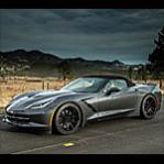



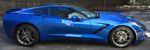


 The Corvette lettering on the rear is tacky and adds no visual appeal




Much Cleaner...IMO

Thread Starter
Melting Slicks


Joined: May 2013
Posts: 2,234
Likes: 30
From: Fairfax VA

Safety Car


Joined: Aug 2004
Posts: 3,966
Likes: 1,295
From: SouthEast PA
Unmodified C8 of the Year 2021 Finalist
2018 C7 of Year Finalist

Race Director


Joined: Oct 2005
Posts: 10,020
Likes: 3,427
From: Plymouth Massachusetts
2025 C7 of the Year Finalist- Unmodified
2024 C7 of the Year Finalist - Unmodified
2020 C7 of the Year Finalist -- Unmodified

Doesnt matter which way looks better for myself I could never remove the letters because the C7 would not be ORIGINAL FACTORY STOCK and I only own ORIGINAL FACTORY STOCK Corvettes!  Congrats on the new C7!

Congrats on the new C7!
Corvette Stories
The Best of Corvette for Corvette Enthusiasts

Top 10 Most Explosive Corvettes Ever Made: Power-to-Weight Ratio Ranked!
Joe Kucinski
150 hp to 1,250 hp: Every Corvette Generation Compared by the Specs That Matter
Joe Kucinski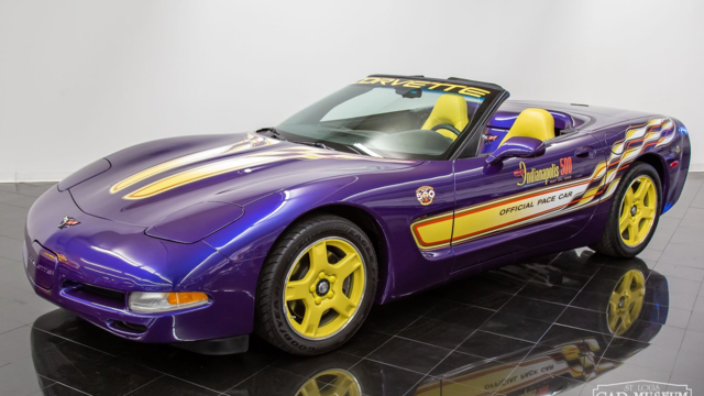
8 Coolest Corvette Pace Cars (and Replicas) of All Time
Verdad Gallardo
Top 10 Corvette Engines RANKED by Peak Torque (70+ Years of Muscle!)
Joe Kucinski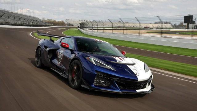
Corvette ZR1X Will Be Pacing the Indy 500, And Could Probably Race, Too!
Verdad Gallardo
Top 10 Corvettes Coming to Mecum Indy 2026!
Brett Foote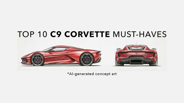
Top 10 C9 Corvette MUST-HAVES to Fix These C8 Generation Flaws!
Michael S. Palmer
10 Revolutionary 'Corvette Firsts' Most People Don't Know
Joe Kucinski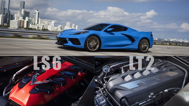
5 Reasons to Upgrade to an LS6-Powered Corvette; 5 Reasons to Stay LT2
Michael S. Palmer
Thread Starter
Melting Slicks
Joined: May 2013
Posts: 2,234
Likes: 30
From: Fairfax VA
Race Director
Joined: Oct 2005
Posts: 10,020
Likes: 3,427
From: Plymouth Massachusetts
2025 C7 of the Year Finalist- Unmodified
2024 C7 of the Year Finalist - Unmodified
2020 C7 of the Year Finalist -- Unmodified
Reminds me also of the C6 GM chicklet badges that were on 2006 -2010 cars and whether or not to remove those or not lots of people did remove them I did not for the same reason as taking off the C7 corvette script on the back or the stingray fish emblem on the front fender .Like I said both ways looks fine it just matters which way you like it because it is YOUR CAR! Nice ride