When you click on links to various merchants on this site and make a purchase, this can result in this site earning a commission. Affiliate programs and affiliations include, but are not limited to, the eBay Partner Network.
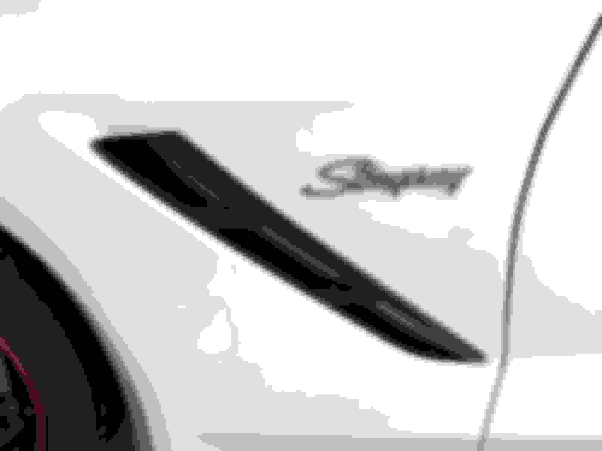
I really hated the Fish Logo on the side. I thought that since the 1970s Corvette had the word Stingray on the side it would be a nice Retro Touch.
I have to tell you since the script goes in different directions on each side this was no small task to measure it out so it looks like it is in same place on both sides. These emblems were not cheap, they were about $50 each. The are the factory emblems made out of pretty heavy metal. They have 3M Automotive Double Stick Tape on the back along with three metal pins. I thought about drilling the hole for half a second and then cut them off with my Dremel.
Looks great! When I had my new 2017 front end expel'd the installer asked me if I wanted the logo put back on. He sent me a pic of what it looked like without it, needless to say I had him leave it off and now they reside in the little cubby hole behind the radio.
I really hated the Fish Logo on the side. I thought that since the 1970s Corvette had the word Stingray on the side it would be a nice Retro Touch.
I have to tell you since the script goes in different directions on each side this was no small task to measure it out so it looks like it is in same place on both sides. These emblems were not cheap, they were about $50 each. The are the factory emblems made out of pretty heavy metal. They have 3M Automotive Double Stick Tape on the back along with three metal pins. I thought about drilling the hole for half a second and then cut them off with my Dremel.
The outcome was just what I was looking for.
Cool.
Those are the best replacements (if you really want to) that I've seen.
St. Jude Donor '05-'06-'07-'08-'09, '14-'15-'16-'17-'18
Interesting alternative to those fish/guitars.
I simply removed those chrome stringray badges from my fenders the week after I bought my car.....I do like the look of what the OP did with that script, though. Here�s hoping he provides us with a wider shot to see the entire car with that script on the side.
Last edited by ExRedRacer; Jul 29, 2018 at 02:46 AM.
As others, I've always like the classic "Stingray" script/emblem and feel the current "fish" emblem is a poor design. However personally, coming from a collecting/buying/selling C2s-C3s background, more appreciate/prefer
Corvettes left factory/OEM stock. To each their own.
Last edited by Kevin A Jones; Jul 29, 2018 at 04:14 AM.
Fish are faster than script...lol If you like it, great, you'll be able to find your Arctic white and black C7 amongst the sea of other Arctic White and black C7's at the cars and coffee... (I'm joking, don't get your panties in a bunch...)
Not anything I would do with my Torch Red Stingray coupe (with the blackout trim option), but it really looks great on your white car. It is definitely a great retro touch!
That is the beauty of the Corvette. There are so many colors, trim levels, options and styles that will appeal to just about anyone.