When you click on links to various merchants on this site and make a purchase, this can result in this site earning a commission. Affiliate programs and affiliations include, but are not limited to, the eBay Partner Network.
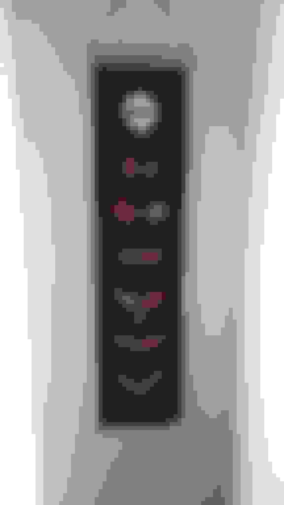
Neither do I. Seems like all they did was to squeeze the lower part of the C7 logo together to make it look a little different. The design artists seem to be lazy on this one.
Sorry, didn't answer the question earlier: C7
Last edited by LanceVette; Jun 24, 2019 at 01:44 PM.
Reason: Left out the answer
I've always like the C5 logo and I really like the C7 logo as I think they got it perfect. I'm still getting used to the C8 logo, so it may grow on me over time, but for right now it looks like someone pinched the C7 logo together. Plus, both my kids go to USF so I see the Bulls logo.
I personally think the new C8 Flags are ridiculous looking, too much angle.. just a giant "V" ithink they could have done a better job on the "next" gen logo.. not very good or interesting. I am sure many will and do like it, but I know what I like when I see it... that ain't it
I've always like the C5 logo and I really like the C7 logo as I think they got it perfect. I'm still getting used to the C8 logo, so it may grow on me over time, but for right now it looks like someone pinched the C7 logo together. Plus, both my kids go to USF so I see the Bulls logo.
Designer Imagines A Corvette That Looks More Like a Corvette Than the Corvette
Slideshow: A Jaguar designer's personal project imagines what a modern front-engined Corvette might look like if Chevrolet revisited the golden age of the Stingray.