


New interior fully uncovered

Popular Reply
Apr 28, 2025, 11:37 AM

Thread Starter
Team Owner

Joined: Feb 2013
Posts: 22,598
Likes: 14,556
It'd be a great question for the designers / engineers that folks should have been able to discuss at the bash... you know at an interior update design presentation... oh wait.
Thread Starter
Team Owner
Joined: Feb 2013
Posts: 22,598
Likes: 14,556
Disagree 100%
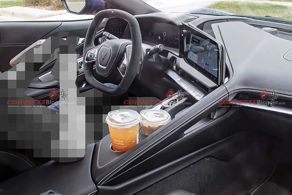
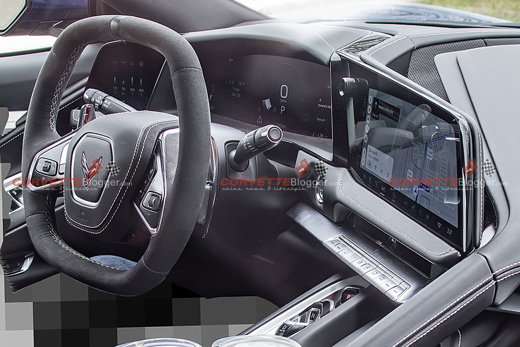
New screen to far left to keep key temps up (or whatever you want) which is great on track. New center option with less clutter given new left screen. Larger right screen as it was too small after Google UI update which stole 20% of the already marginal screen (drive a '24 or '25 to see). Much better placement of phone charger and easier use of mode selector. Cup holders are a wash to me.
New screen to far left to keep key temps up (or whatever you want) which is great on track. New center option with less clutter given new left screen. Larger right screen as it was too small after Google UI update which stole 20% of the already marginal screen (drive a '24 or '25 to see). Much better placement of phone charger and easier use of mode selector. Cup holders are a wash to me.
Melting Slicks


Joined: Jul 2005
Posts: 2,490
Likes: 1,018
From: Boston
St. Jude Donor '09, '21
Disagree 100%
New screen to far left to keep key temps up (or whatever you want) which is great on track. New center option with less clutter given new left screen. Larger right screen as it was too small after Google UI update which stole 20% of the already marginal screen (drive a '24 or '25 to see). Much better placement of phone charger and easier use of mode selector. Cup holders are a wash to me.
New screen to far left to keep key temps up (or whatever you want) which is great on track. New center option with less clutter given new left screen. Larger right screen as it was too small after Google UI update which stole 20% of the already marginal screen (drive a '24 or '25 to see). Much better placement of phone charger and easier use of mode selector. Cup holders are a wash to me.
Thread Starter
Team Owner
Joined: Feb 2013
Posts: 22,598
Likes: 14,556
It'd be a great question for the designers / engineers that folks should have been able to discuss at the bash... you know at an interior update design presentation... oh wait.
Instructor


Joined: Dec 2024
Posts: 112
Likes: 97
Corvette Stories
The Best of Corvette for Corvette Enthusiasts

Top 10 Most Expensive Corvettes Ever Sold on Bring A Trailer
Brett Foote
10 Things Every Corvette Owner Needs (2026 Edition)
Michael S. Palmer
8 Most "Only Corvette Owners Understand" Quirks and Problems
Pouria Savadkouei
10 Reasons the C6 Z06 is Still A Performance Benchmark After 20 Years
Joe Kucinski
How Much Horsepower Every Corvette Engine "LOST" in 1972
Joe Kucinski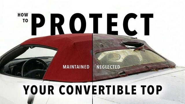
Top 10 DOs and DON'Ts for Protecting Your Convertible Top!
Michael S. Palmer
Top 10 Most Explosive Corvettes Ever Made: Power-to-Weight Ratio Ranked!
Joe Kucinski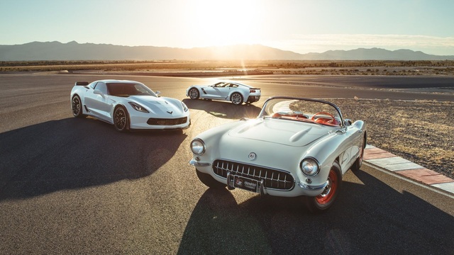
150 hp to 1,250 hp: Every Corvette Generation Compared by the Specs That Matter
Joe Kucinski
8 Coolest Corvette Pace Cars (and Replicas) of All Time
Verdad GallardoRacer

Joined: Nov 2022
Posts: 390
Likes: 413
From: Naples FL
Hey Rapid - all those ney sayers owe you an apology - you were right!
I like it - right step in the evolution of design - but not enough for me to trade my 23 Z - I really like my wall.
Where is the mode selector? Can't see in picture. Is it under the grab handle?
I like it - right step in the evolution of design - but not enough for me to trade my 23 Z - I really like my wall.
Where is the mode selector? Can't see in picture. Is it under the grab handle?

Burning Brakes


Joined: Mar 2022
Posts: 1,150
Likes: 939
From: West Palm Beach, FL
Decent change, nothing to lose ones mind over. Those cup holders dont look to be able to be covered away which I do not like but look better than the Cobalt level plastic currently there.
The larger screen is nice but not life changing, temp controls for passengers actually look to be less accessible than before. The O **** bar is a nice add for sure though.
The far left screen will have some nifty info though!
Let's see how long this thread lives. @RapidC84B this may be short lived, good thing I took a couple snips...


Melting Slicks

Joined: Sep 2004
Posts: 3,477
Likes: 2,248
From: Southern NJ
I like it. It's essentially the CT5 33" screen split into 3 sections. So it does give the C8 it's own distinct dash display keeping the sports car cockpit feel, but at the same time giving the benefits of the widescreen display
Thread Starter
Team Owner
Joined: Feb 2013
Posts: 22,598
Likes: 14,556


Purveyor of Common Sense

Joined: Apr 2017
Posts: 1,166
Likes: 628
From: Chicago Suburbs IL
St. Jude Donor '19

Burning Brakes
Joined: Mar 2022
Posts: 1,150
Likes: 939
From: West Palm Beach, FL
I am fine with push rod V8, just need to get to 7000RPM and 520-550HP. Shouldn't be that hard to do. I wouldn't be super surprised.