


Console data plate (spot the differance)
Melting Slicks


Joined: Aug 2013
Posts: 2,456
Likes: 934
2025 Corvette of the Year Finalist - Unmodified
2024 C3 of the Year Winner - Unmodified
So there are a ton of differences, here are just a few:
Font and boldness
Spacing between fonts and spacing on left edge
Trim around flags
Flag design is different
Silver areas are more raised
Font and boldness
Spacing between fonts and spacing on left edge
Trim around flags
Flag design is different
Silver areas are more raised
Melting Slicks


Joined: Jul 2006
Posts: 3,103
Likes: 802
From: Massapequa Park NY
Other specifics about the fonts and spacing:
On the top example, the words "cubic inches" are longer than the word "horsepower". On the bottom example, horsepower is longer than cubic inches.
On the top the zero in "460" is over the first zero in "11.00:1". On the bottom the zero in 460 is over the second zero in 11.00:1.
just like with repro paperwork, they can get it close, but not perfect.
Corvette Stories
The Best of Corvette for Corvette Enthusiasts

Top 10 Most Expensive Corvettes Ever Sold on Bring A Trailer
Brett Foote
10 Things Every Corvette Owner Needs (2026 Edition)
Michael S. Palmer
8 Most "Only Corvette Owners Understand" Quirks and Problems
Pouria Savadkouei
10 Reasons the C6 Z06 is Still A Performance Benchmark After 20 Years
Joe Kucinski
How Much Horsepower Every Corvette Engine "LOST" in 1972
Joe Kucinski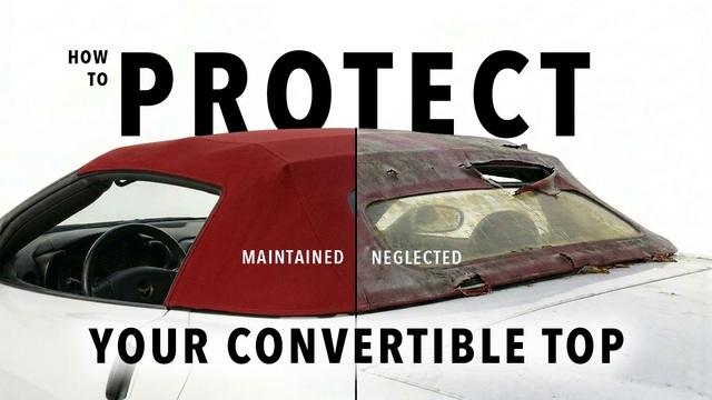
Top 10 DOs and DON'Ts for Protecting Your Convertible Top!
Michael S. Palmer
Top 10 Most Explosive Corvettes Ever Made: Power-to-Weight Ratio Ranked!
Joe Kucinski
150 hp to 1,250 hp: Every Corvette Generation Compared by the Specs That Matter
Joe Kucinski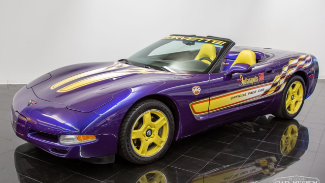
8 Coolest Corvette Pace Cars (and Replicas) of All Time
Verdad GallardoBurning Brakes

Joined: May 2018
Posts: 797
Likes: 156
From: England AR
Lettering isn't bold like the original, different font and even the numbers are a different font
take the 427
the 4: edges are sharp on one, flattened on the other where lines meet
the 2: the first one is curved on the lower body from midpoint, the second is more a straight line from midpoint to bottom left edge
the 7: no curve from the right top to the bottom left
im not bothering with the rest, its just all wrong, now the letters are close, you have to pretty much have them side-by-side to notice, the lettering tho, you can tell that a mile away
Last edited by naramlee; Jan 11, 2019 at 02:45 PM.