


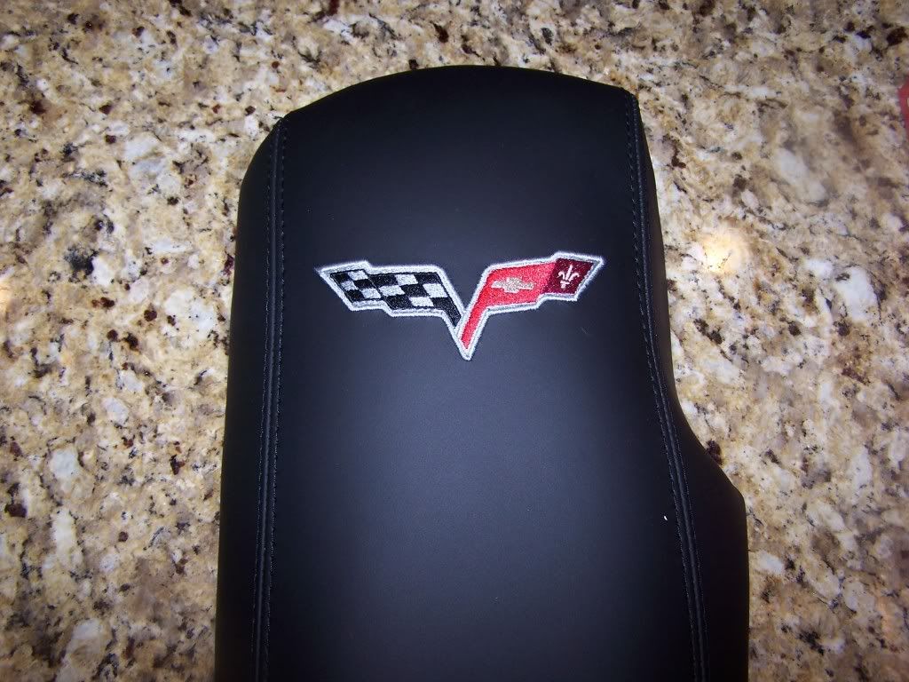
Does This Look Crooked??
Melting Slicks

Joined: Jan 2004
Posts: 2,246
Likes: 5
From: West Coast
Except in this case, the lid is 100% fine. It looks great.
Melting Slicks

Joined: May 1999
Posts: 2,886
Likes: 173
From: Scottsdale AZ
St. Jude Donor '11
My point is that the rest of the car is far from "perfect", it has flaws from the factory. Why go nuts over something so trivial? Even if it is aftermarket. Actually, the aftermarket has worse quality control, IMHO. If you buy aftermarket parts, they usually always have some type of "fit & finish" issue.
Except in this case, the lid is 100% fine. It looks great.
Except in this case, the lid is 100% fine. It looks great.

Racer

Joined: May 2008
Posts: 420
Likes: 0
From: Cobb CA
Safety Car

Joined: Nov 2006
Posts: 4,023
Likes: 266
From: San Jose California
If it's off at all it's off very little and, given where it will be in the car, no one is ever going to look at it in such a way that the question will come up. Except for the owner, of course, who will now always be unhappy with it since he's now convinced that it's wrong. 
Perfection is a goal that is never achieved. So the question is always "what level of IMperfection can you live with?"
Personally, I think the thing is fine. But if the OP is unhappy with it then the vendor should take it back and refund him the $$. That's easy enough. Then get one _without_ the logo
Z//
Racer

Joined: Sep 2009
Posts: 316
Likes: 7
From: North Stonington Connecticut
St. Jude Donor '11-'12, '14
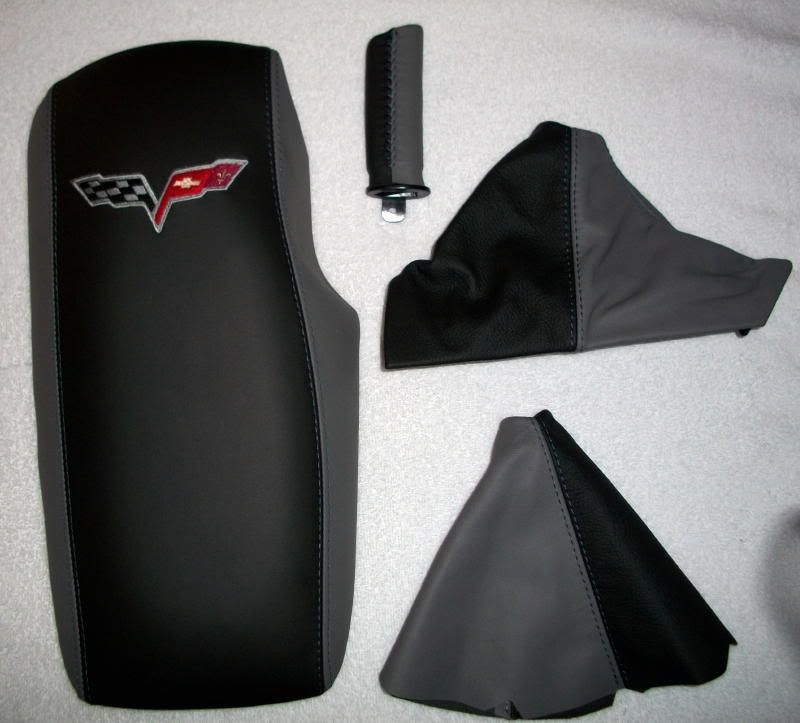
Looks crooked. It also appears that the stitching along the right side trails off at the top which I think also makes the C6 Logo appear "bent". I looked at mine and both the right sides stitching and C6 Logo are very straight and sharp.
Corvette Stories
The Best of Corvette for Corvette Enthusiasts

Every 2027 Corvette Engine Explained
Joe Kucinski
Designer Imagines A Corvette That Looks More Like a Corvette Than the Corvette
Verdad Gallardo
10 Ugly Corvettes That We Still Kinda Love
Joe Kucinski
Top 10 Most Expensive Corvettes Ever Sold on Bring A Trailer
Brett Foote
10 Things Every Corvette Owner Needs (2026 Edition)
Michael S. Palmer
8 Most "Only Corvette Owners Understand" Quirks and Problems
Pouria Savadkouei
10 Reasons the C6 Z06 is Still A Performance Benchmark After 20 Years
Joe Kucinski
How Much Horsepower Every Corvette Engine "LOST" in 1972
Joe Kucinski
Top 10 DOs and DON'Ts for Protecting Your Convertible Top!
Michael S. Palmer
Pro

Joined: Sep 2010
Posts: 599
Likes: 0
From: Lake in the Hills IL
St. Jude Donor '12-'13
Melting Slicks

Joined: Dec 2009
Posts: 3,213
Likes: 17

 Install in and don't be so **** about it.
Instructor
Joined: Jun 2009
Posts: 187
Likes: 0
Scroll the page down until the emblem in the first picture just touches the lowest horizontal line of the toolbars at the top of your browser. The top right corner of the emblem is definitely higher than the top left corner
Tech Contributor


Joined: Sep 2008
Posts: 10,954
Likes: 261
From: Greensboro NC
2015 C6 of the Year Finalist
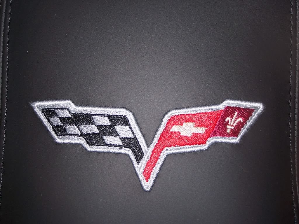
I have one that looks similar. (see below)
It looked slightly off to me but not enough to worry about it. I had seen others that looked similar so I figured that was the way DSV crossed flags logos were made. Just figure it as flags blowing in the wind.
Also, It looks 10 times better than what I had before.


It looked slightly off to me but not enough to worry about it. I had seen others that looked similar so I figured that was the way DSV crossed flags logos were made. Just figure it as flags blowing in the wind.
Also, It looks 10 times better than what I had before.
Last edited by ncvette_1FUNRIDE; Jan 2, 2011 at 09:47 AM.
CF Senior Member


Joined: Feb 2006
Posts: 23,313
Likes: 25
From: Tucson Arizona
It's difficult to tell with the irregular shape of the detached console lid but you may be right. When the console lid is mounted (in the car) the emblem may be skewed slightly...not on a 'level' perpendicular line with the sides of the car.
First off, the emblem itself is fine...for all practical purposes its 'level' and symmetrical. I put the image into the graphics software I use. I isolated the emblem and split it into two halves. I did a mirror image of the right half which I overlaid on the opposite side. It matches-up just fine.
With the overall image it's difficult to tell...not only due to its possible angle in the photograph but also due to the irregular shape of the console lid. We're not dealing with a perfect rectangle. Just overlaying straight lines (rectangles) onto the console it appears that when the piece is installed in the car, the emblem will be out of alignment with the car. I'm guessing the emblem will appear to be somewhat crooked.
Whether its annoying enough to cancel the order and demand a refund only you can decide. I sympathize with you though...I'm sort of a 'symmetry nut' myself. I like things to be balanced and line-up correctly. Good luck!
Last edited by Wayne O; Jan 2, 2011 at 09:56 AM.
Pro
Joined: Oct 2006
Posts: 615
Likes: 57
From: Fairborn oh
The silver edge stitching on the right side is off by the width of that stitching. That's about the difference. Take a ruler and go straight across the emblem and you'll see. It's not much but the length of the pad itself it also a bit longer on the right side making it appear that much more off. I have the same pad in red. It's about the same.
Having said that, it's not enough you should worry about.
Having said that, it's not enough you should worry about.