When you click on links to various merchants on this site and make a purchase, this can result in this site earning a commission. Affiliate programs and affiliations include, but are not limited to, the eBay Partner Network.
What a clueless comment! Yet another person that's stuck in the past and can't let go!! Current GM basically is nothing like the GM from that era! And wtf does a Fireo have to do with a Corvette??
As far as the C8 logo....I wouldn't mind seeing it without the Chevrolet bow tie logo.
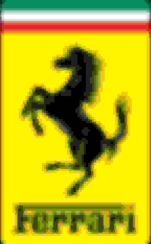
Had a little spare time today and we all know there isn’t a lot of new ME info to speculate on. So I’ve had some time to make up another ME Zora Logo with my ‘V’ incorporated. This one based on being rectangular, modeled on the Ferrari’s Logo which uses the dimensions of ‘The Golden (Rectangle) Ratio’. Goggle search and this Ratio is used throughout the auto industry, in logo designs and even the auto designs themselves, is with the Ferrari. My design uses a white background trimmed in blue, both historic as racing colors for the US of A.
Very cool. You do have some time today. I like your latest one, though the rectangle shape is IMO not appealing; however, if you made it an oval, personally would prefer it. And yes please for all who have influence, for lets replace the French flag with an American one!
Very cool. You do have some time today. I like your latest one, though the rectangle shape is IMO not appealing; however, if you made it an oval, personally would prefer it. And yes please for all who have influence, for lets replace the French flag with an American one!
i would love to see our US Flag replace the French Fluer de lie on the C8 and/or the ME. Sorry, I tried and it didn�t look right. I will try it as an oval. But Chevrolet (the man) history may win out as well as Corvette�s too. As to why I made the rectangular Zoro Logo? I like how Ferrari uses two logos on the 488, the front rectangular with the side a shield. BUT, 1) I�m not a big fan of using a shield, 2) a round logo has Corvette history, 3) I think a tall rectangular shield on the front looks better than round, and 4) then put the round logo on the side. So, close to what Ferrari does, with major differences, and in a way send a message.
<<<<<<< I think I still like this round better than one oval. The below oval example does not look right as the ‘V’ and words leave too much empty space.
I like your idea that since we can not have an American flag, we could have the red white and blue filling up part of the V. Well done jbc1995fb.
However, and if you wish to play with this a little more, it is “tighter V” a la the one in the key fob, so maybe you might wish to meld the two. We need to remember the formula that the C8’s emblem total height is the same as its width. (Thank you Skank for that.)


 So I’ve had some time to make up another ME Zora Logo with my ‘V’ incorporated. This one based on being rectangular, modeled on the Ferrari’s Logo which uses the dimensions of ‘The Golden (Rectangle) Ratio’. Goggle search and this Ratio is used throughout the auto industry, in logo designs and even the auto designs themselves, is with the Ferrari. My design uses a white background trimmed in blue, both historic as racing colors for the US of A.