


Plasti-Dip gone WILD!
Thread Starter
Team Owner


Joined: May 2010
Posts: 20,593
Likes: 127
From: Sugarcane town Florida
If so, I think I might agree. I wondered if it was to much having the red bottom part. It just might look better with all black rear.
Thread Starter
Team Owner
Joined: May 2010
Posts: 20,593
Likes: 127
From: Sugarcane town Florida
Are you talking about the center black stripe on the roof? Carry it down to the hood, splitting it down the center?
Pro

Joined: Mar 2011
Posts: 720
Likes: 2
From: Walnut Creek CA
I like your approach of doing the plasti-dip test to see how things look and then moving forward with the mod the "right" way.
I like the black top and rear fascia. If it were mine, I'd get rid of the black on the rear deck and make the stripes on the rear deck black instead of red. Also, if you're going to stripe the hood and the roof, I think it looks best if it looks like a continuous stripe (even if you're changing stripe color).
The GS stripes look like they're too far back in the fender well - almost like they're sliding back. You might play with bringing them forward and also bringing the hood stripes down onto the front fascia a bit.
Thread Starter
Team Owner
Joined: May 2010
Posts: 20,593
Likes: 127
From: Sugarcane town Florida
Corvette Stories
The Best of Corvette for Corvette Enthusiasts

Top 10 Most Expensive Corvettes Ever Sold on Bring A Trailer
Brett Foote
10 Things Every Corvette Owner Needs (2026 Edition)
Michael S. Palmer
8 Most "Only Corvette Owners Understand" Quirks and Problems
Pouria Savadkouei
10 Reasons the C6 Z06 is Still A Performance Benchmark After 20 Years
Joe Kucinski
How Much Horsepower Every Corvette Engine "LOST" in 1972
Joe Kucinski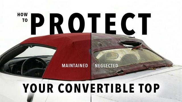
Top 10 DOs and DON'Ts for Protecting Your Convertible Top!
Michael S. Palmer
Top 10 Most Explosive Corvettes Ever Made: Power-to-Weight Ratio Ranked!
Joe Kucinski
150 hp to 1,250 hp: Every Corvette Generation Compared by the Specs That Matter
Joe Kucinski
8 Coolest Corvette Pace Cars (and Replicas) of All Time
Verdad Gallardo
Melting Slicks


Joined: Jul 2005
Posts: 2,586
Likes: 2
From: Bardstown Kentucky
Administrator


Joined: Mar 2001
Posts: 368,390
Likes: 24,795
From: In a parallel universe. Currently own 2014 Stingray Coupe.
C7 of the Year - Modified Finalist 2021
MO Events Coordinator
St. Jude Co-Organizer
St. Jude Donor '03 thru '26
NCM Sinkhole Donor
CI 5, 8 & 11 Veteran
OK, here goes:
Likes: I like the changes you did to the center caps and the calipers. And, I do like the front vent treatment as well as the hashmarks, although they do seem to be a bit far back on the fender. The rear fascia is OK, but would look better IMO if it were totally blacked out instead of leaving the lower vent portion red.
Dislikes: Just not feeling the front stripes, roof stripes, and the rear deck stripes.
But I will say it is a different approach to making the car looks different than all the rest and for that, you get a .
.
Likes: I like the changes you did to the center caps and the calipers. And, I do like the front vent treatment as well as the hashmarks, although they do seem to be a bit far back on the fender. The rear fascia is OK, but would look better IMO if it were totally blacked out instead of leaving the lower vent portion red.
Dislikes: Just not feeling the front stripes, roof stripes, and the rear deck stripes.
But I will say it is a different approach to making the car looks different than all the rest and for that, you get a
.

Pro
Joined: Mar 2011
Posts: 738
Likes: 0
From: Tuscaloosa AL
I'm going to plasti-dip my windshield tonight. yeah I live on the edge. 
I really like the look Torch. It all looks really nice. I haven't seen that kind of design on the trunk/rear bumper before, is that an original idea?
I really like the look Torch. It all looks really nice. I haven't seen that kind of design on the trunk/rear bumper before, is that an original idea?


Thread Starter
Team Owner
Joined: May 2010
Posts: 20,593
Likes: 127
From: Sugarcane town Florida

And don't Dip your dog. Mine wasn't very happy with me.
I guess it's original. I don't really know.
I do know why it looks the way it does. The rear deck was originally going to be mostly black. I was going to start where the quarter fenders meet the roof pillar. There is a curved body seam that starts by the roof pillar and comes back along the trunk. I was going to make that my line and then most of the trunk would have been black. I still think that might look best.
But then I saw the trunk has a body contour molded into it that comes off at the base of the roof pillar and tapers back to the rear of the car. I know you have seen it. It is slightly raised. I thought that might look interesting if I followed that line with the black. And that is why the top of the deck looks the way it does. I can always come back and add more black to fill out the complete trunk.
And the reason the two red stripes stop where they do on the butt.....I'm lazy!
I didn't want to try and tape the edges of the stripes through the indented Corvette logo.  I figured it was simpler to stop above the Corvette letters and it would still give me an idea of how it was going to look. I think the two stripes do need to come on down to the tag, or further.
And the GS stripes....might be to far back. I'm not sure. But I wanted them to look more racey.? So I made them wider at the top by the hood and tapered them down as they get closer to the wheel opening. I might try moving them forward a bit and see. But I do like the tapered look better then the square type.
The different options can make one......


Thanks for all the input so far.
I'll be doing the hood again Sunday I think.
Last edited by TwoSmoke; Jul 8, 2011 at 09:10 PM.


Le Mans Master


Joined: Nov 2009
Posts: 6,882
Likes: 234
From: Bangkok, Thailand
Took me a couple of looks but I like it now. I think the thing that looks odd to me is the dip in the middle of the back where the stripes continue off the trunk and down over the vertical part of the rear bumper. To me it would have looked better to end the stripes up top like hte Z16's do (I think) and also to complete the black color on the entire backend - the low part around the exhaust. The blackouts around the fog lamp area are great!
Just my opinion and we know how those are
 to you for being original and trying something different!
Just my opinion and we know how those are
to you for being original and trying something different!
Last edited by mcm95403; Jul 8, 2011 at 10:15 PM.
Tech Contributor
Joined: Aug 1999
Posts: 16,376
Likes: 404
From: Should this thoughtful, valuable contribution meet with no acknowledgement or 'thanks' this post----
Very creative...I'm not going to say I like this and don't like that like the others...my interpretation is you weren't looking for that kind of response. What you did accomplish: this product is way more versatile than any of us thought, and that is a major contribution to this forum....your talent and imagination is hard to match. You wouldn't be left-handed would you?
Here's the 2012 Boss 302 similar paint scheme design approach....also one badass 444hp car!


Here's the 2012 Boss 302 similar paint scheme design approach....also one badass 444hp car!