


View Poll Results: What would you do?
Voters: 129. You may not vote on this poll
Opinions Requested
Melting Slicks


Joined: Dec 2007
Posts: 3,371
Likes: 5
From: Mission Viejo, CA
St. Jude Donor '10, '15-'16
The overall design of that emblem doesn't fit with the rest of the car, IMO. Font, size, color, badge shape is not consistent with the rest of the C5 design language.
Drifting


Joined: Aug 2005
Posts: 1,314
Likes: 3
From: Simi Valley CA
I say take them off. Your car is clean as is and that badge sort of "cheapens" the look. Plus its always nice to be stealth. No need to advertise that it's supercharged.
And I'll say it again....your engine bay is perfect. Beautifully done!
And I'll say it again....your engine bay is perfect. Beautifully done!
Drifting
Joined: Oct 2003
Posts: 1,932
Likes: 4
From: Warrenville Il
[QUOTE=Yellow03Z06;1583965149]I say take them off. Your car is clean as is and that badge sort of "cheapens" the look. Plus its always nice to be stealth. No need to advertise that it's supercharged.
QUOTE]

No need to advertise. Hearing the supercharger is enough of an advertisement.
QUOTE]
No need to advertise. Hearing the supercharger is enough of an advertisement.
Thread Starter
AKA "The CLOWN"

Joined: Feb 2010
Posts: 6,261
Likes: 13
From: Chicago South Suburbs
I really wasn't to excited after I put them on, I was hoping to hear more positive replies, but I think we are all thinking along the same lines!
I am also looking into have some custom emblems made by Austin Barnett. He is going to email me some ideas later today to look at!
I am also looking into have some custom emblems made by Austin Barnett. He is going to email me some ideas later today to look at!
Last edited by Blitzkrieg; May 22, 2013 at 03:54 PM.
Corvette Stories
The Best of Corvette for Corvette Enthusiasts

Top 10 Most Expensive Corvettes Ever Sold on Bring A Trailer
Brett Foote
10 Things Every Corvette Owner Needs (2026 Edition)
Michael S. Palmer
8 Most "Only Corvette Owners Understand" Quirks and Problems
Pouria Savadkouei
10 Reasons the C6 Z06 is Still A Performance Benchmark After 20 Years
Joe Kucinski
How Much Horsepower Every Corvette Engine "LOST" in 1972
Joe Kucinski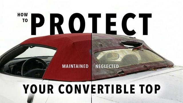
Top 10 DOs and DON'Ts for Protecting Your Convertible Top!
Michael S. Palmer
Top 10 Most Explosive Corvettes Ever Made: Power-to-Weight Ratio Ranked!
Joe Kucinski
150 hp to 1,250 hp: Every Corvette Generation Compared by the Specs That Matter
Joe Kucinski
8 Coolest Corvette Pace Cars (and Replicas) of All Time
Verdad GallardoBurning Brakes

Joined: Mar 2013
Posts: 949
Likes: 34
From: La Junta Colorado
the poll says keep them.
I don't care for just those. I am looking at the LS1, HP and Supercharged in one badge.
kinda like the Z06 badge.
I wish I could just run z06 badges when my car is done... but vette groups hate that.
I don't care for just those. I am looking at the LS1, HP and Supercharged in one badge.
kinda like the Z06 badge.
I wish I could just run z06 badges when my car is done... but vette groups hate that.


Thread Starter
AKA "The CLOWN"
Joined: Feb 2010
Posts: 6,261
Likes: 13
From: Chicago South Suburbs
These emblems were 17.00 for the pair, little loss to remove them,
Burning Brakes
Joined: Jan 2012
Posts: 946
Likes: 0
From: Alameda Ca
That is the way to go. I plan on getting a 1 off set for my car as well, but in the middle of some other upgrades right now
Melting Slicks


Joined: Mar 2008
Posts: 2,962
Likes: 254
From: Richmond, Ky
Austins badges are awesome and fit the car. The one you have reminds me of the guys putting chrome letters on their rides with their wheel size ( the only thing they have to talk about usually ). Yours is understated enough that they don't diminish the look of your car but it adds nothing. JMHO.
Melting Slicks
Joined: Jun 2003
Posts: 2,170
Likes: 48
From: Yuma CO
Senior Member
Cruise-In V Veteran
Okay, here goes.......I like them very much and here's why. They are clean, simple, understated, and directly to the point.
I have seen the custom emblems you are talking about and that guy does awesome work, but........what you have now is so clean and doesn't shout LOOK AT ME (the emblem, I mean). It is just there, stating fact for anyone who knows enough to look and take notice of just what may be lurking next to them.
Jmho
DSTURBD