


New Forum Format
Abby Normal


Joined: Dec 2001
Posts: 53,446
Likes: 92
From: Press "2" for English
so far i'm not thrilled with it either. mainly because there wasn't any warning. or at least, i didn't see any. i am having to relearn how the forum works. it will get better so everybody just relax. if it's too much for you right now just take a few days off and come back this weekend. hell, by sunday i'll bet most of these complaints will be addressed.
funny, alot of these complaints are the same complaints i read (and even posted) the last time CF changed, from the "red" format to the last one. it will get better.
funny, alot of these complaints are the same complaints i read (and even posted) the last time CF changed, from the "red" format to the last one. it will get better.
Abby Normal
Joined: Dec 2001
Posts: 53,446
Likes: 92
From: Press "2" for English
hell, i've seen changes made since i logged on just a couple hours ago. it will get better! 
oh, and to address that one complaint posted earlier: man, it's not the software that makes this the best forum on the net, brother.
oh, and to address that one complaint posted earlier: man, it's not the software that makes this the best forum on the net, brother.
Thread Starter
Gr8Corvette

Joined: Jun 2003
Posts: 1,139
Likes: 2
From: Indian Harbour Beach Florida
Originally Posted by clutchdust
hell, i've seen changes made since i logged on just a couple hours ago. it will get better!
oh, and to address that one complaint posted earlier: man, it's not the software that makes this the best forum on the net, brother.
oh, and to address that one complaint posted earlier: man, it's not the software that makes this the best forum on the net, brother.


Le Mans Master


Joined: Oct 2002
Posts: 6,855
Likes: 2
From: Grovetown GA
Originally Posted by Yoggi
I agree too.
Racer


Joined: Mar 2004
Posts: 271
Likes: 0
From: Stockton CA
Agree with Jinx. You have GOT to give us the option to turn off the pop up ugly yellow info window. That is terrible and reminds me why most Asian airports won't allow any flickering neon lights in the line of sight to the approach to a runway.
The rest I can live with, though this is a real case for "Why fix it, when it ain't broke?"
Sempi
The rest I can live with, though this is a real case for "Why fix it, when it ain't broke?"
Sempi
Corvette Stories
The Best of Corvette for Corvette Enthusiasts

Top 10 Most Expensive Corvettes Ever Sold on Bring A Trailer
Brett Foote
10 Things Every Corvette Owner Needs (2026 Edition)
Michael S. Palmer
8 Most "Only Corvette Owners Understand" Quirks and Problems
Pouria Savadkouei
10 Reasons the C6 Z06 is Still A Performance Benchmark After 20 Years
Joe Kucinski
How Much Horsepower Every Corvette Engine "LOST" in 1972
Joe Kucinski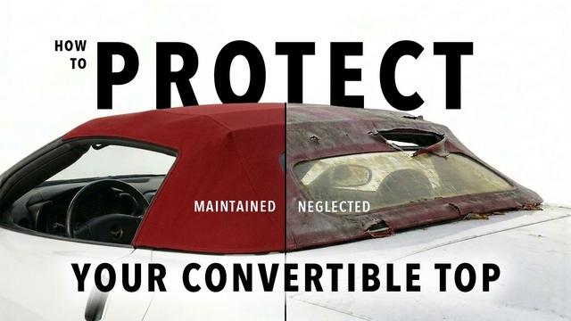
Top 10 DOs and DON'Ts for Protecting Your Convertible Top!
Michael S. Palmer
Top 10 Most Explosive Corvettes Ever Made: Power-to-Weight Ratio Ranked!
Joe Kucinski
150 hp to 1,250 hp: Every Corvette Generation Compared by the Specs That Matter
Joe Kucinski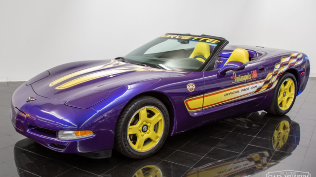
8 Coolest Corvette Pace Cars (and Replicas) of All Time
Verdad Gallardo
Burning Brakes

Joined: Oct 2001
Posts: 919
Likes: 1
From: Portland area OR
Originally Posted by mdhmi
A simple announcement would have been a worthwhile courtesy. My suspicion is that the change from ZeroForum to vBulletin was prompted by licensing issues. Personally, I think this is a very sad day for CorvetteForum. The CorvetteForum web site used to be the nicest forum based group on the internet in my opinion. The old site would resize text windows, the colors (bluish) weren't fatiguing on the eyes, etc. etc. The new site looks just like every other vBulletin site on the internet. Pretty lame for a Corvette site to have the same carnival look as the F-Body site.
Gripes:
-- The overuse of the color red. This is absolutely hideous!. More templates need to be installed!.
-- The display of user nics should be truncated. Uselessly long nics like – 'myredvetteisfast2002withM6anditsavert' causes the actual post text to be pushed too far to the right.
-- Minimal 'smiley' list. Current list should be severely augmented.
-- 'Location' should be displayed under the avatar.
-- If vBulletin can't handle pic resizing then sig pics should be disallowed. (Post a bloody link we know what Corvettes look like and for the love of God if I really cared about the weather in PoDunk I'd go to weather.com).
-- Performance stinks.
Ahhhh. Now that I've vented I would like to point out that I'm sure given time that the new site will improve and that we should be supportive of our sponsors and our moderators.
I'm waaayyyy overdue for a smoke .. Later.
Mark
Burning Brakes
Joined: Nov 2003
Posts: 1,226
Likes: 0
From: Louisville TN
St. Jude Donor 06
I liked the "old" forum style allot better, but in the end no matter how much complaining goes on in this thread it is stiill your sandbox. Now were did I put that shovel? 